
I Made a Tool for Making Line Graphs Online

Creating clean, customizable line graphs shouldn't require downloading complex software or wrestling with spreadsheets. That’s the idea that sparked the creation of my latest project — a free online line graph maker that helps anyone create beautiful, easy-to-read line graphs in just a few clicks.
Whether you're a student, teacher, content creator, or data analyst, this tool was built to make your life a little easier when it comes to visualizing trends and patterns in your data.
🌟 Why I Built This Tool
While working on various data visualization projects, I often needed to generate quick line graphs for presentations or web content. I realized that most of the existing tools were either too basic, too complex, or hidden behind a paywall.
I wanted something:
Fast – no installation, no signup.
Customizable – control over labels, colors, gridlines, etc.
Shareable – export as PNG, JPG or SVG.
User-friendly – usable even by someone who doesn’t know what "data series" means.
So, I decided to build it myself.
🛠️ How It Works
The tool is web-based and works on any device with a browser. Here’s a quick overview of how it works:
1. Enter Your Data
You can either:
Enter your X and Y values manually.
Copy-paste data from a spreadsheet (it supports comma separated values).
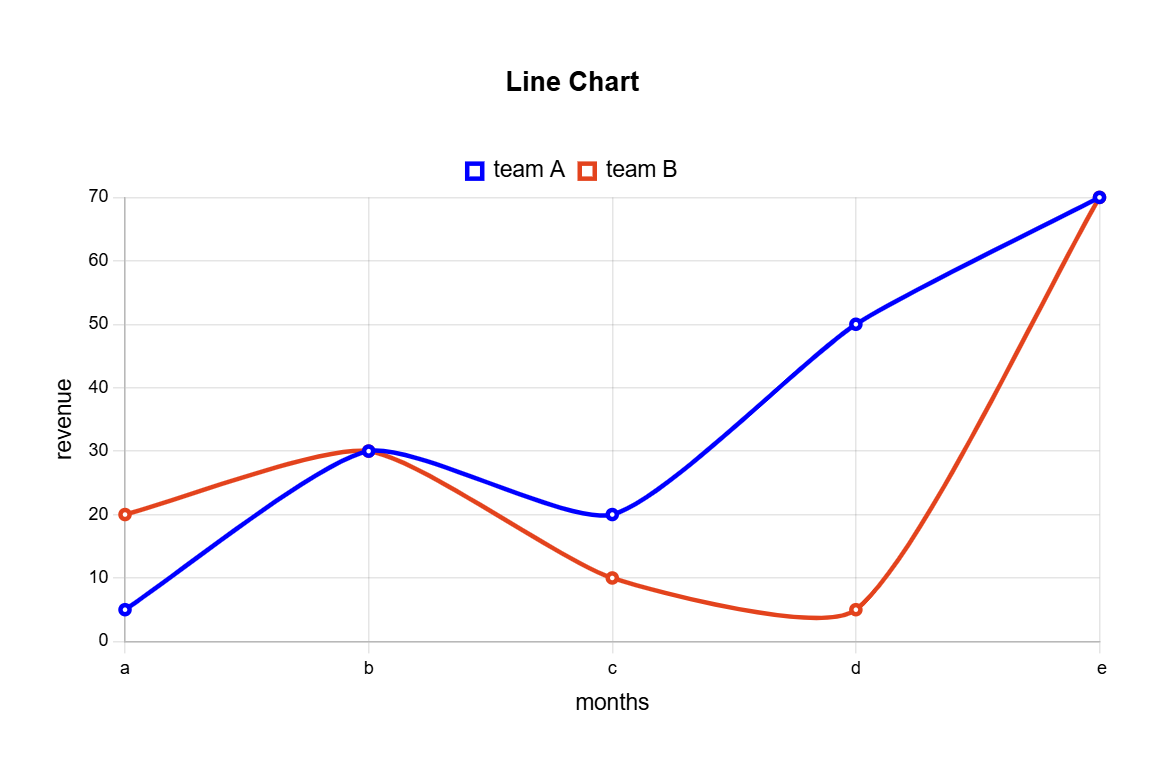
Add multiple series to compare different data trends on the same graph.
2. Customize Your Graph
You can tweak nearly every aspect of your graph:
Change the line color, style, and thickness.
Add axis labels and a chart title.
Show/hide gridlines and points.
Adjust the scale of the axes manually or keep it automatic.
3. Download or Share
Once you’re happy with your line graph, export it as:
PNG and JPG for presentations or documents.
SVG for high-quality printing or web use.
🎯 Who It's For
This tool is useful for:
Students and Teachers – to visualize math or science data.
Bloggers and Writers – to embed graphs into articles.
Analysts – for quick visual checks before deeper analysis.
Social Media Creators – to share data-driven stories.
Whether you're plotting population growth, tracking website traffic, or showing temperature changes, this tool makes the process smooth and intuitive.
🔍 A Peek Under the Hood
Here’s a bit of tech info for those curious about how I built it:
Frontend: React + Tailwind CSS for a responsive UI.
Graph rendering: Built using Chart.js with custom configurations.
Data handling: Lightweight parsing and validation using plain JavaScript.
No backend required – all processing is done in-browser for speed and privacy.
I focused on making it fast and privacy-friendly — no data is stored or tracked. What happens in your browser, stays in your browser.
💡 Features I Plan to Add
Here are some enhancements I’m considering for future updates:
Support for saving graph settings locally.
Ability to import CSV files directly.
More graph types (bar, scatter, area).
Dark mode for night owls.
Embeddable HTML iframe code for websites.
If you have suggestions or feature requests, I’d love to hear them!
🚀 Try It Out!
You can try the tool right now:
👉 Line Graph Maker - Try it here
It’s completely free to use — no signup required.
Thanks for checking out my line graph maker! I hope it helps make your data storytelling easier and more visually compelling. If you found it useful, feel free to share it with others or drop me a message with your feedback.
Happy graphing! 📈